
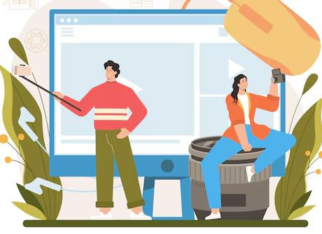
We always talk about the advantages of why having good blog layouts matters. Let’s flip the script today and start by discussing how your blog sections will look without a good blog website layout.
Source: Freepik
Imagine you open a blog post because of an interesting headline. But it welcomes you with an unformatted page title in regular text. Right below, you find text-heavy information in oversized fonts with no visuals. And the search button doesn’t work correctly. Overall, the blog is cluttered with too many widgets, buttons, and distracting elements, making it hard to focus on the content.
Will you continue reading or leave it immediately? Of course, you’ll leave it to explore more blogs with good blog layouts. Simply put, great blog layouts help you make your content visually appealing and easily digestible, enhancing the overall reading experience. Let’s explore below the best blog layouts and what you can learn from them.
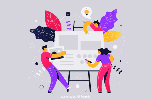
Why Blog Layout Matters
Source: Freepik
In plain terms, layout in blogging means how different elements are arranged together to keep the text easily readable. There are millions of blogs on the internet but only some are considered beautiful blogs. Why?
This is because they work on blog site design and layout features e.g. headings, typography, font sizes, spacing, graphics, and much more. Let’s explore below in detail why blog page layouts matter.
Improves user experience
First impressions count! A clean, well-structured, and user-friendly blog page layout with a professional look grabs attention and establishes credibility. It makes it easier for readers to find relevant information, follow the narrative, and interact with the content. This helps you achieve the blog’s purpose as well as reap SEO benefits.
Enhances readability
As discussed earlier, no one wants to read information on a cluttered page. All you need is a well-structured blog layout with easy-on-the-eyes text to level up the readability factor. Make sure to incorporate proper font size, ample white spaces, and a catchy color scheme to make the content easier to consume.
Streamlines navigation
Leveraging out-of-the-box blog post layout ideas helps you create a logical and intuitive layout with clear navigation elements. These elements include a menu bar, sidebar, blog post categories, recent posts, and related searches. Integrating them ensures a smooth browsing experience for the readers and lets them easily find the content they’re looking for.
Increases engagement
Attractively cool blog layouts guide readers toward your desired actions. Consider keeping your website blog layout exactly like them with strategic placement of call-to-action buttons, social sharing icons, and comment sections. It encourages readers to spend more time on your blog which positively impacts metrics like time on page and bounce rate.
Reinforces branding
The layout reflects your blog’s overall branding and visual identity. The best blog post layouts are cohesive and visually appealing and help establish a consistent and memorable online presence. This makes it evident that only creating excellent content is not enough to be successful. As, in the words of Gary Vaynerchuk, “What you do after you create your content is what truly counts.”
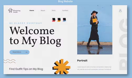
What Makes For a Good Blog Layout
Source: Freepik
No matter how outstanding your content is, you need to work on the blog layout best practices to include it in the list of the best blog site designs.
Header
The header is the first thing your reader sees while exploring your blog. Keep it simple, concise, and eye-catching with a prominent logo, a clear blog title, and a search bar. Ensure it eases access to main pages and content while establishing the blog’s brand identity.
Menu/ Navigation Bar
The next important element of blog layouts is a well-placed navigation bar or a menu bar. It helps readers easily find and access different sections of the blog, such as categories, archives, and author profiles.
Main Content Area
This is the heart of good blog layouts. Organized content with a clear typography hierarchy makes it easy for readers to scan and understand the information. Hence, use headings, subheadings, bullet points, images, and appropriate spacing to break up long text blocks.
Sidebar
A strategically placed sidebar makes it simple for readers to explore the blog further. It is a valuable space to highlight recent/ popular posts, social media links, archives, and email subscription forms. Avoid clutter and keep it visually distinct from the main content area.
Footer
The footer is the bottom section of the blog that usually houses essential links, such as copyright information, contact details, social media icons, and links to important pages. Here’s an idea: consider adding a newsletter signup option here to build your audience.
Top 5 Blogs With Good Blog Layouts
Let’s explore the best blog layouts next to get ideas for your personal blog!
A List Apart
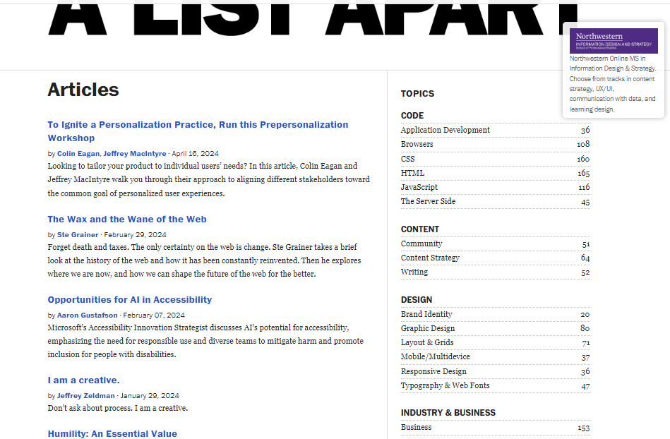
Source: A List Apart
A List Apart is one of the best examples of a simple blog layout. Jeffrey Zeldman and Brian Platz co-founded it in 1997 simply as a mailing list for web designers. Jeffrey changed it into a web magazine (blog) in 1998. A List Apart offers insightful articles on web design, development, and content strategy.
It stands out with a clean, minimalist layout that complements its content. Hand-drawn visuals make the user experience even better. It also features sharp typography, ample white space, strategic margins, and comfortable font sizes. Well-structured headings enhance navigation, and its responsive design adapts seamlessly to all devices.
Zoho Desk
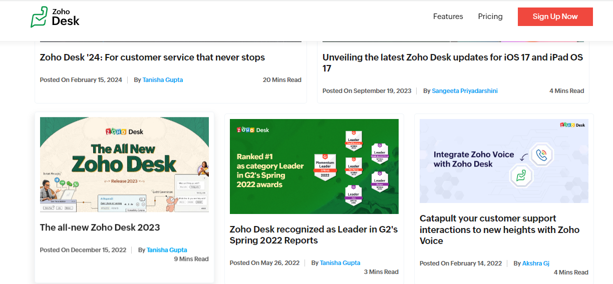
Source: Zoho Desk
Zoho Desk is our next pick for the best blog post layouts. It’s a sleek, professionally-run blog by Zoho Corporation, dedicated to customer service and support insights. It prioritizes readability with a clean, clutter-free layout. With well-optimized headings and subheadings, it offers balanced text and interesting visuals that maintain engagement.
This blog likely uses a mid-size font for comfortable reading and consistent spacing throughout that allows the content to breathe. This focus on user experience makes the content easy to digest and perfect for busy customer service professionals searching for helpful information. A right-side search feature and popular posts below help keep readers engaged.
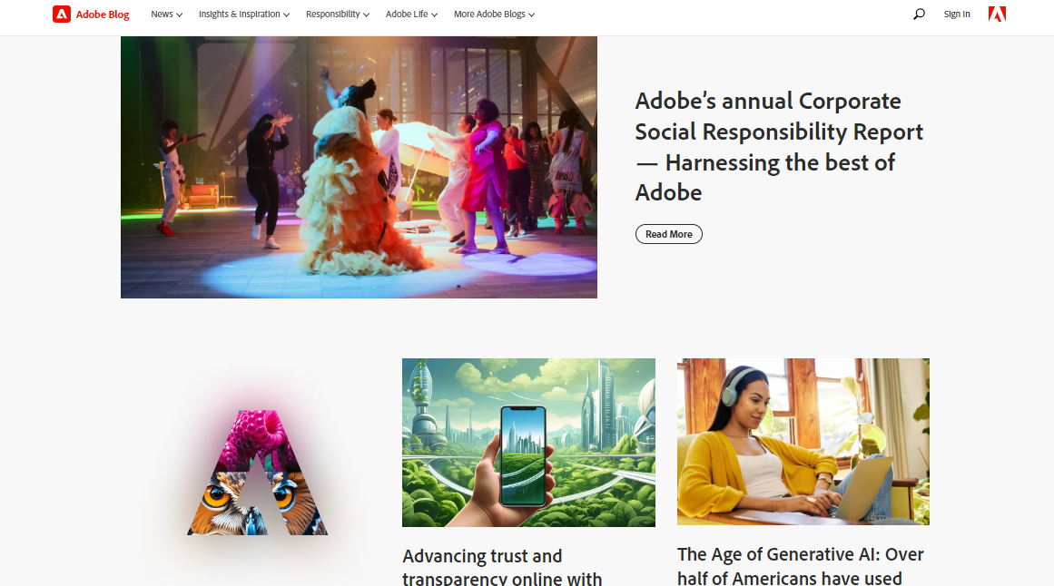
Adobe Blog
Source: Adobe Blog
Next up, the Adobe Blog is a visually appealing and well-organized space managed by Adobe. It covers Adobe product updates, industry trends, and creative design inspiration. With balanced spacing, it uses well-sized fonts for readability and intuitive navigation to guide readers through the content. The visuals here do the talking.
A sticky navbar and a prominent search feature make it easy for readers to access popular posts. Overall, it ensures a comfortable reading experience, making it both aesthetically pleasing and functional. What we love about this blog is its strategic placement of social media icons in the top right corner of every blog post to keep readers engaged.
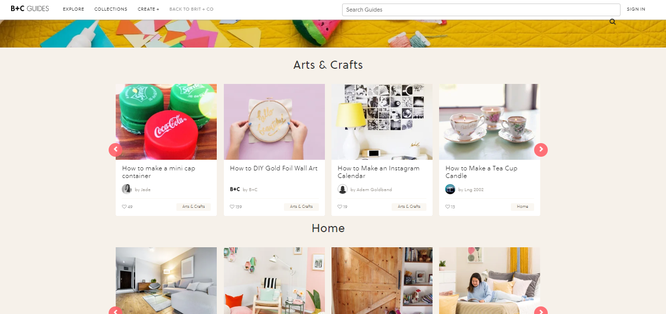
B + C Guides
Source: B + C Guides
B + C Guides (aka Brit + Co Guides) is a great aesthetic blog example. It supports all passionate women out there with a do-it-yourself attitude. Brit Morin founded it in 2011 and the blog has reached a community of 175M+. It offers creative and informative tutorials on art, design, food, pop culture, style, DIY, and more. Its cool color scheme complements its sleek and user-friendly design.
The main focus of B + C Guides is on readability with clear headings, subheadings, and text below them. The navigation bar at the top is simple with clear labels for different categories. You can also explore trending stories located in the sidebar as you navigate the blog. It’s a great example to follow for creating a lifestyle blog of your own.
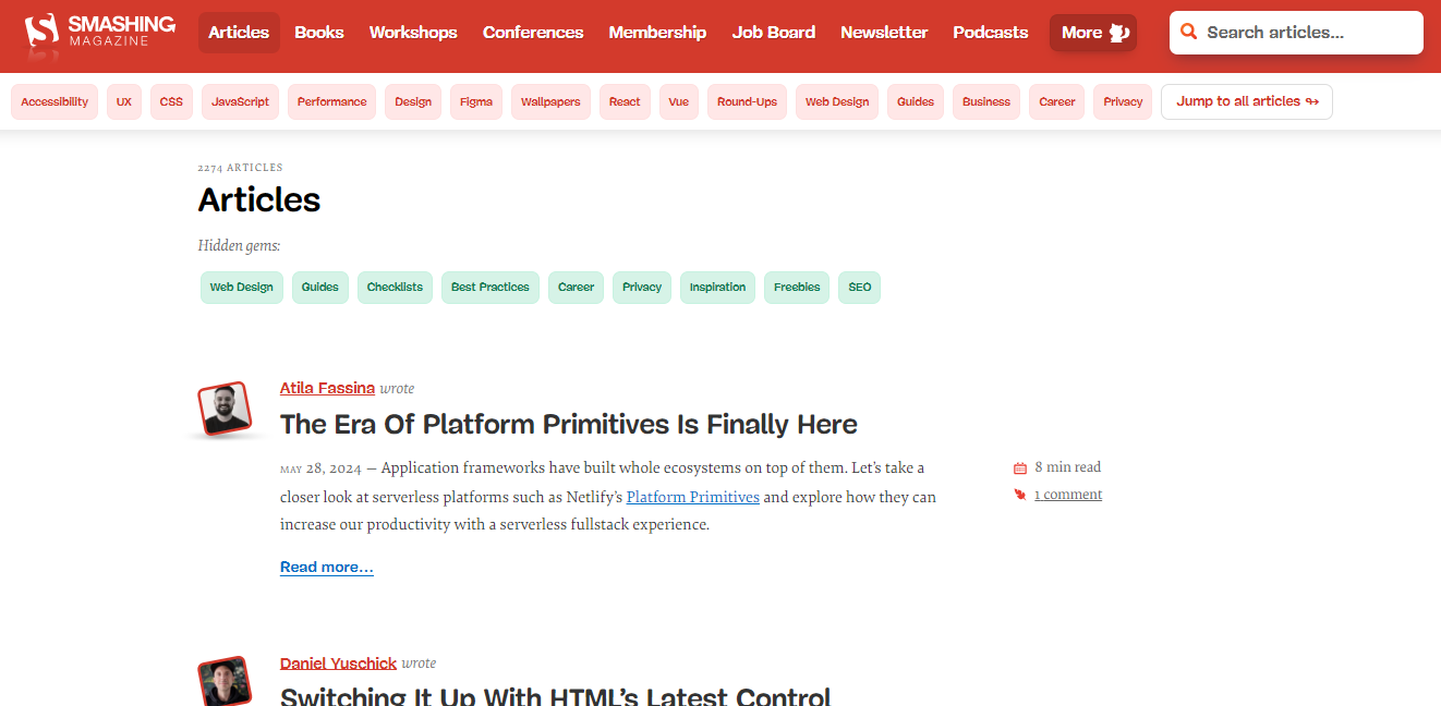
Smashing Magazine
Source: Smashing Magazine
Smashing Magazine, curated by a team of web design experts, is a go-to resource for UI/ UX designers and developers alike. Once you step in, it welcomes you with a catchy red-colored menu bar. Right below, there’s a light-themed bar that categorizes blog topics with keywords running from accessibility, UX, and CSS to Javascript, design, Figma, and more.
Its layout is top-notch, featuring a responsive design. With ample white space, reading it is a breeze, also thanks to thoughtfully chosen fonts and different sizes for headlines and body text. Colorful visuals also break up the text. It’s one of the best technical blog examples that prioritizes readability and user experience, all while maintaining a fun and engaging atmosphere.
Final Thoughts
A blog’s layout is crucial for enhancing user experience and SEO. It makes it easier for readers to find what they’re looking for and engage with the content. With this blog post, we aimed to cover good blog layouts in detail. We discussed why layout matters along with important elements and the top 5 examples.
Great layout and compelling content go hand in hand. So, if you’re looking to get blog post ideas, here’s our tool to help you! Use our fully customizable Free Blog Post Idea Generator and get unlimited content ideas today.

I am a full-time online marketer, for over a decade now. Helped over 100,000+ people & generated well over $12M in online sales.